
Ren & Stimpy: The gorgeous, grotesque cartoon that broke TV animation open
If you were a 90s kid parked in front of Nickelodeon, Ren & Stimpy felt like a transmission from another planet.
It premiered on August 11, 1991 as one of the original “Nicktoons,” alongside Doug and Rugrats, and it immediately detonated the idea of what TV cartoons could look and feel like: painterly backgrounds, rubbery acting, classical squash-and-stretch, and those infamous “gross-up” close-ups that zoomed into pores, scabs, stubble, and boogers with oil-painting seriousness.
The series ran five seasons through 1995 (with a final first-run airing on MTV in 1996) and remains a cult touchstone for animators and comedy nerds alike.
Ren & Stimpy: Why it still hits
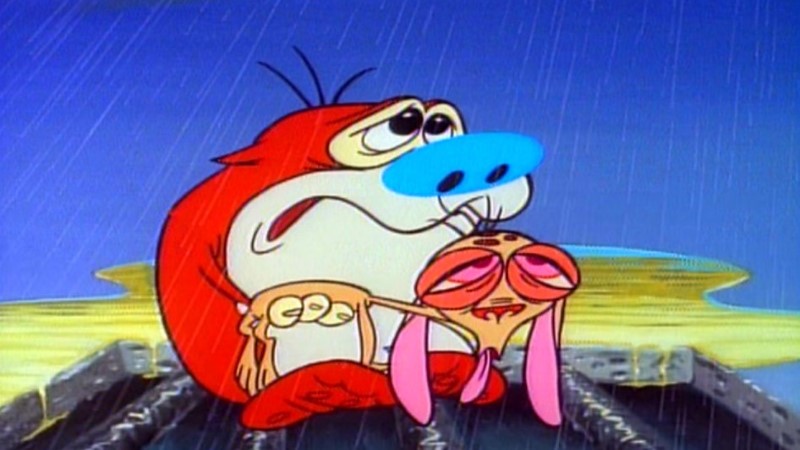
The premise is deceptively simple: Ren Höek (a rage-prone chihuahua) and Stimpson J. Cat (a sweet, dim Manx) ricochet from space epics to domestic disasters to meta TV parodies. Think “Space Madness,” the “Log” commercials, “Happy Happy Joy Joy,” and the masterpiece “Stimpy’s Invention.”
For me, the charm is the contrast—lush, painterly beauty wrapped around the dumbest, pettiest impulses. Even when the jokes go low (and they often do), the timing and drawings go high. That tension is why fans still swear by it: it’s exquisite draftsmanship in service of exquisitely stupid behavior. (That’s a compliment.)
The look: painted backgrounds, character layout, and the infamous “gross-ups”
If you Google “Ren & Stimpy backgrounds,” you’ll fall into a rabbit hole of art by Bill Wray—the painter who helped define the show’s rich, illustrative look.
Those manicured interiors, moody skies, and nicotine-stained wallpapers made the characters “pop” and gave the ugliness a weird, gallery-worthy beauty. Wray has discussed developing those ultra-detailed close-ups (often influenced by Basil Wolverton’s grotesques).
Fans and crew commonly call them “gross-ups,” and they became a calling card of the series (and later, half the 90s).
Inside the animation pipeline, the show re-centered the old-school discipline of character layout—drawing specific acting poses between storyboard and animation to lock down performance.
That was a big deal at the time; it’s a technique creator John Kricfalusi evangelized on his production blog, and it’s one reason the acting in early episodes feels so sharply directed and “on model” emotionally, not just visually.
On top of that, the show embraced smear frames, held poses, and extreme squash-and-stretch with timing that nodded to golden-age theatrics—but filtered through 90s irony and shock humor.
The result: images you can freeze-frame and admire like illustration, and sequences that move with musical precision.
The studios and who actually drew it
The first two seasons were produced by Spümcø, then the show moved to Games Animation (which evolved into Nickelodeon Animation Studio) for Seasons 3–5.
Alongside those prime studios, Carbunkle Cartoons (the Canadian outfit led by Bob Jaques and Kelly Armstrong) delivered some of the best-animated episodes in the run; many animators still cite Carbunkle’s work for its nuanced acting and elastic energy. Rough Draft Studios would also become a key production partner later on.
The artists behind the drawings
Beyond Kricfalusi, the bench was deep and frankly legendary:
- Bob Camp (director/co-developer, later the showrunner during the Games Animation years)
- Jim Smith, Chris Reccardi, Lynne Naylor (co-founder of Spümcø and pivotal to the character designs), Vincent Waller, Bill Wray (art director/background painter), Bob Jaques and Kelly Armstrong (Carbunkle), among others. These names are worth searching individually; their fingerprints are all over 90s/2000s animation.
As for voices, Billy West gave Stimpy his lovably earnest wobble (and later took over Ren), while Kricfalusi originally voiced Ren in Seasons 1–2. West’s choices—half doofus, half choirboy—make some of the darkest gags feel oddly tender, which is Ren & Stimpy in a nutshell.
Why fans loved it (and what set it apart)
- Craft: The show revived classical animation ideas—layouts, expressive timing, and painterly backgrounds—on weekly TV. That was unheard-of in 1991 Nickelodeon land.
- Tone: It walked a razor’s edge between sweetness and sadism. Ren’s volcanic temper against Stimpy’s saintly optimism made even quiet scenes feel dangerous.
- Design + timing: The staging is readable. Every gag has a clear acting beat and silhouette; every scream lands because the drawings “aim” your eye where the joke pays off.
- Those “gross-ups”: Love ’em or hate ’em, the detailed stills made TV animation feel handmade again.
The controversies you can’t ignore
Part of the show’s history is turbulent. Nickelodeon fired Kricfalusi in 1992 over standards clashes and production delays, and Games Animation took over for Seasons 3–5.
Years later, serious allegations of sexual misconduct by Kricfalusi came to light, detailed by multiple outlets and addressed in the 2020 Sundance documentary Happy Happy Joy Joy: The Ren & Stimpy Story.
These reports are sobering and cast a long shadow over the legacy conversations. (As a fan of the work, I think it’s important to separate admiration for the craft from accountability for real-world behavior.)
The Spike TV spinoff that… didn’t work
In 2003, Kricfalusi revived the brand as Ren & Stimpy “Adult Party Cartoon” for Spike TV. It was edgier (often graphically so) but short-lived and widely panned; only three episodes aired before it was pulled. For me, it proves how precarious the original balance was: push too far into explicitness and the elegance collapses.
Techniques and little-known production details
- Character layout was central—locking specific acting poses and eye lines before any animation went overseas, to preserve performance intent.
- Painted backgrounds by Bill Wray gave even gross jokes a gallery sheen.
- Gross-up close-ups combined fine-art rendering with grotesque subject matter, explicitly cited by artists as inspired by trading cards and Basil Wolverton’s textures.
- Studio mix: Early Spümcø episodes used Carbunkle Cartoons for standout animation; later Rough Draft Studios became a workhorse.
- Crew roll call worth exploring for art-style lineage: Bob Camp, Jim Smith, Lynne Naylor, Chris Reccardi, Vincent Waller, Bill Wray, Bob Jaques—many later shaped SpongeBob, Samurai Jack, and beyond.
Where the franchise stands now (recent developments)
In August 2020, Comedy Central announced an adult-skewing reimagining/revival of Ren & Stimpy—without Kricfalusi’s involvement. Over the past few years, the project’s status has been murky, with credible trades confirming the greenlight and later fan chatter about delays.
In August 2025, the fan-news site NickALive noted that Paramount+ added a show page for the reboot, suggesting the company still intends to do something with it. (There have also been scattered reports of limited international listings and leaks, but official U.S. release plans remain unclear at the time of writing) .
If you’re tracking how the show’s DNA lives on beyond direct revivals, look at contemporary projects explicitly channeling that 90s hybrid of hand-drawn elasticity and hyper-detailed close-ups; for instance, Polygon recently spotlighted a 2025 pilot (Bullet Time) borrowing that look/feel and even collaborating with veteran artists like Bill Wray. The influence is everywhere.
My verdict, 30-plus years on
Ren & Stimpy is the paradox I still love: a show that wowed you with craft while grossing you out with gags. The best episodes are basically animation masterclasses—watch “Stimpy’s Invention” frame-by-frame and you’ll see staging and eye-trace choices that wouldn’t be out of place in a Chuck Jones short, just covered in cat hair and earwax.
The worst impulses (on and off screen) are harder to square, and the real-life allegations against the creator deserve to be front-and-center in any honest retrospective. But in terms of the art of TV animation—the layouts, the timing, the painterly ambition—Ren & Stimpy shoved the door open. A generation of artists walked through it.


